Clients:
Cornell SC Johnson College of Business (Client)
Briteweb (Agency)
Role: UX Designer, Business Analyst, Systems Designer
Duration: January 2019 – September 2021
Brief
I joined Briteweb on a contract basis, excited to take on Cornell University as my first client. Collaborating with another designer, we set out to apply a systematic and UX-focused approach to their comprehensive web redesign.
The Challenge
In 2016, three leading business schools from different industries merged to form Cornell’s SCJ College of Business. While a textbook example of synergy, this merger presented formidable organizational challenges, including unifying their distinct philosophies, values, and websites.
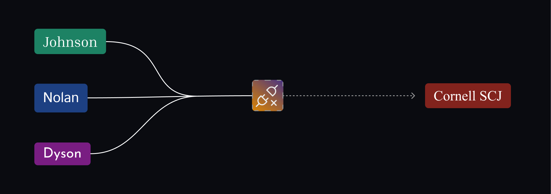 We needed to bridge the gaps between these institutions.
Goal
Our mission was clear: Unify three distinct institutions through a cohesive digital experience. We became the architects building the foundation for their cohesive online presence.
Strategy
The path forward required strategic clarity, user empathy, and careful systems thinking. Here’s how we tackled the challenge:
Step 1: Insights
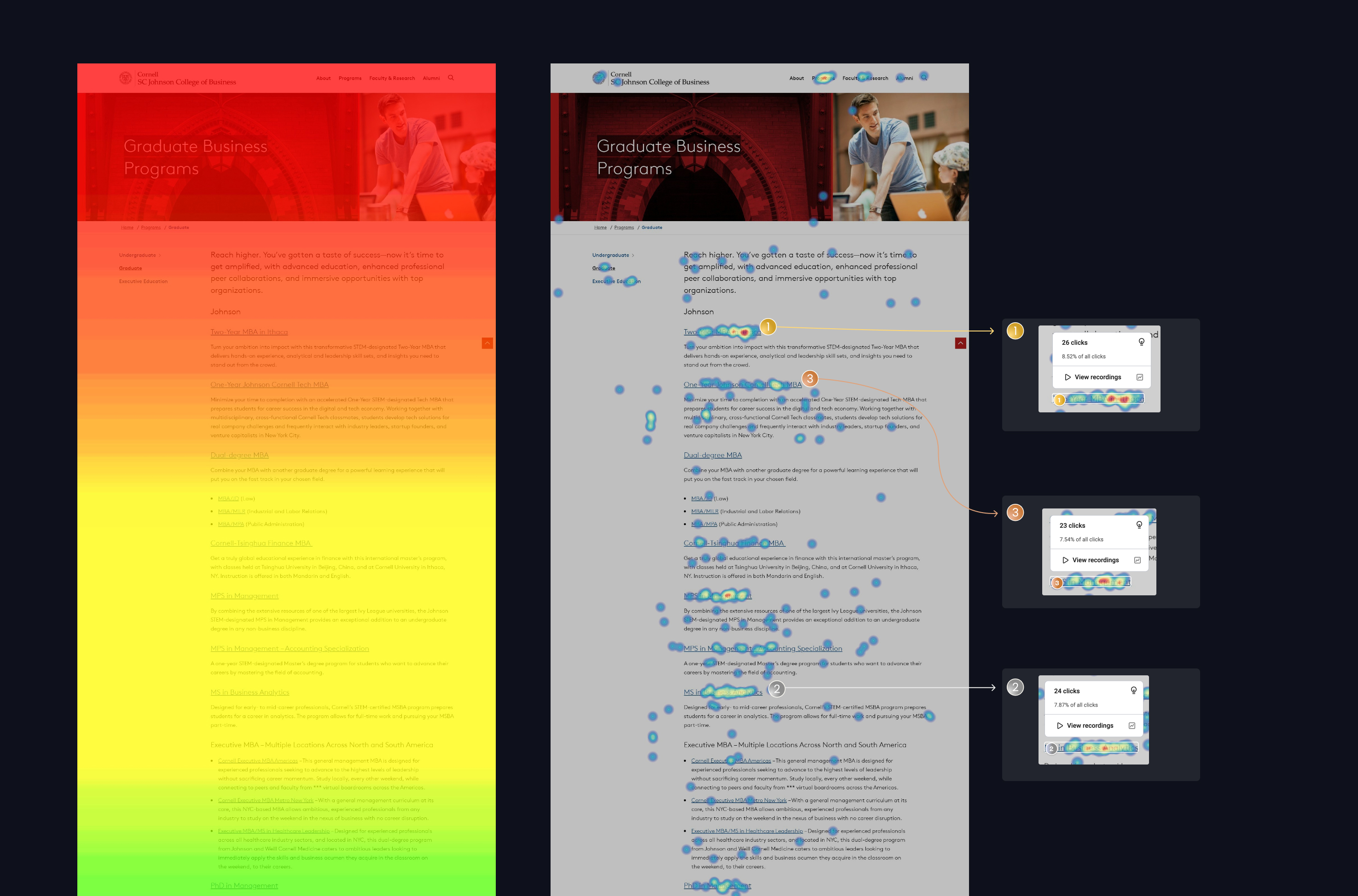
We started by focusing on what I do best: analysis. By delving into both qualitative observations and quantitative data, we illuminated the path forward through data-driven decision-making. Our findings confirmed our suspicions: The three combined sites resulted in an inconsistent experience, leading to user confusion and drop-off. Session replays and bounce rate data revealed key drop-off points, leading to targeted UX improvements across high-traffic pages.
 Users need a clear path from point A to point B.
Sounds nerdy. Tell me more about data.
We combined web analytics with direct user observations to locate the friction points in user journeys. This blend of quantitative and qualitative analysis gave us clarity about where the design system was failing users.

Strategically, the best place to start is by checking our map (quantitative data) to get a broad idea of where the gold is buried. Once we’re close, we can pull out our metal detector (qualitative observations) to sweep the area and pinpoint the treasure.
 A strategic approach allows us to pinpoint problems and better prepare ourselves to solve them.
Step 2: Understand the User
Recognizing that users were grappling with inconsistent experiences, we identified key user archetypes and documented them thoroughly. By viewing the website through the lens of a Prospective Student, for instance, we could tailor our user stories to address real needs, propelling us toward our goal of unify three distinct institutions through a cohesive digital experience.
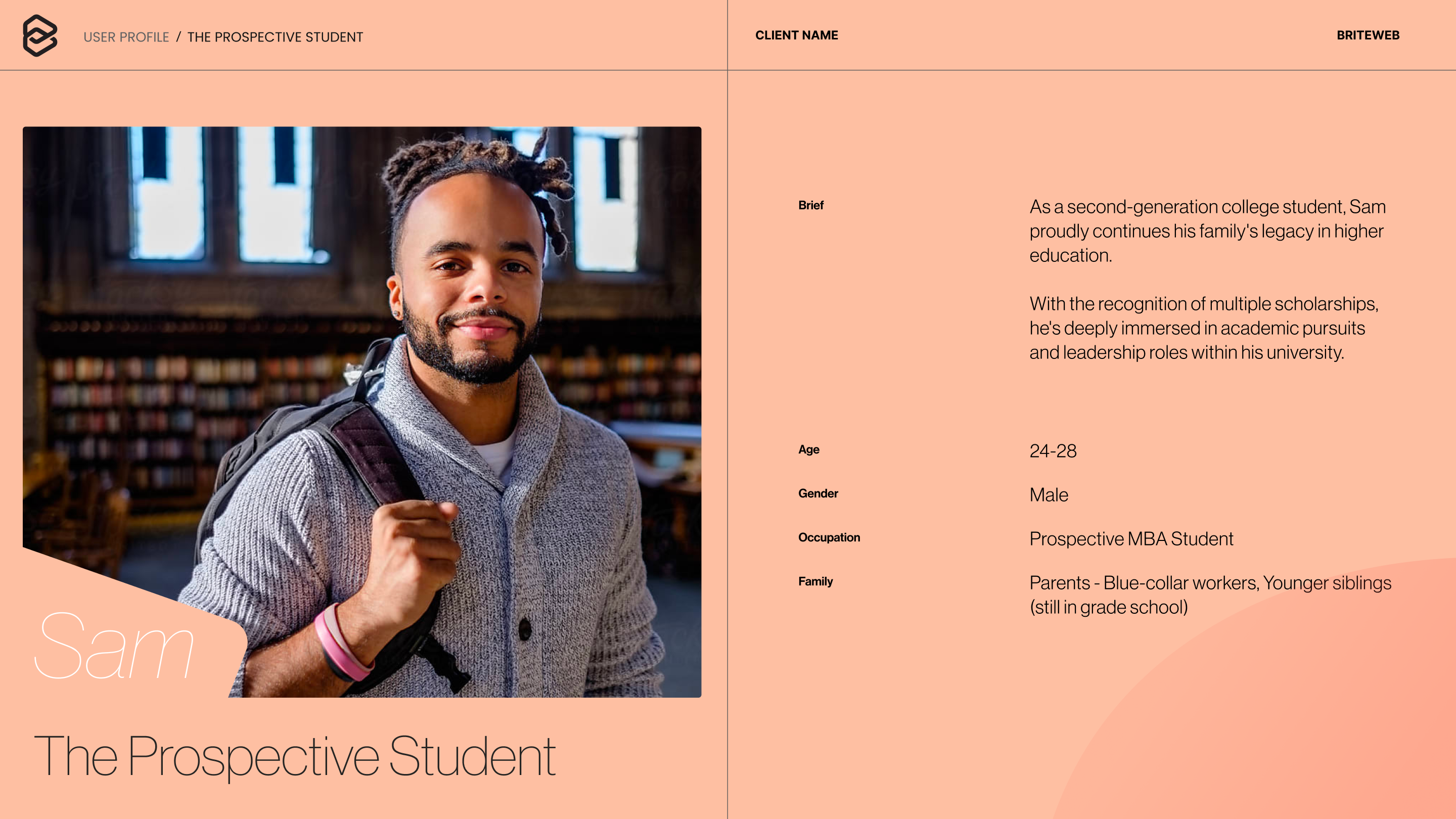 A solid persona roots our design in real-world needs.
Drafted and sorted by user archetype, our user stories provided the foundation for designing the new site with the end-user and consistency in mind. The ideation process also led to several innovative concepts that helped guide cross-institutional alignment.
How does inconsistency hurt our UX?
When you create a product and hand it to a user, something magic happens: they start to form a relationship with it. This relationship is built on trust, and nothing erodes trust like inconsistency.
Imagine navigating a site that changes its layout on every page—it erodes trust just like someone constantly changing their story.
 Remember how confusing your last tax return was? That’s what inconsistency feels like in UX.
Consistency helps users feel confident and engaged. Breaking that consistency leads to frustration and abandonment.
Step 3: Module Design
With user flows established, we dived into design. This iterative process covered all modules (page sections) the client might need. Collaborating closely with another talented designer, I ensured that every detail was meticulously documented. Knowing that SCJ Cornell would take over the Figma file, we applied UX principles directly to the design system itself—making the components, documentation, and file structure intuitive and maintainable.
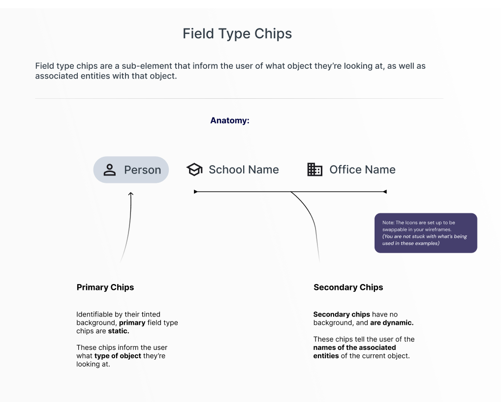 Detailed documentation ensured clarity for future contributors and developers.
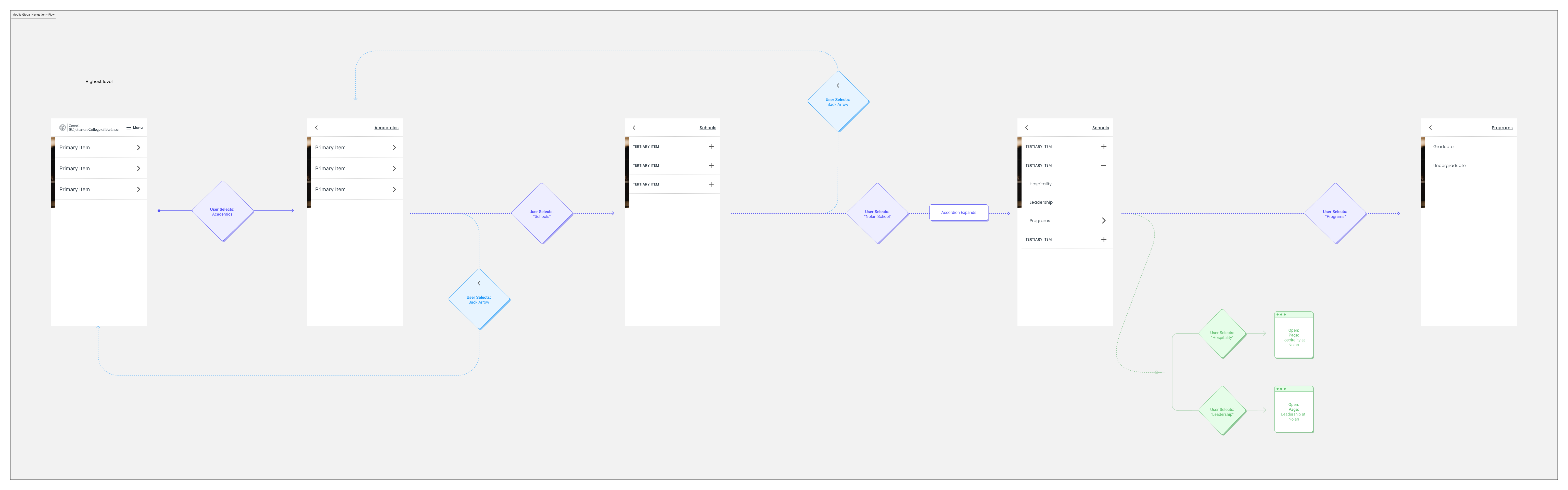
Step 4: Navigation
Part of our initial approach was building a navigational system. I prototyped it, and we adapted it as we went along. This system played a pivotal role in establishing intuitive site-wide patterns. For a deeper dive, feel free to reach out.
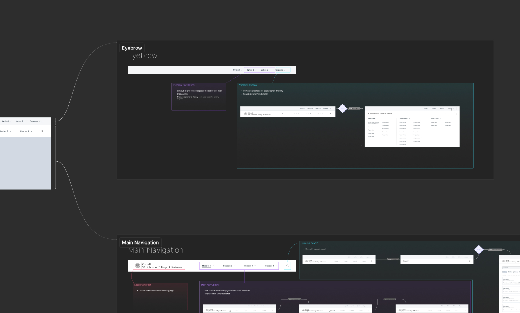 Flowcharts articulate how everything is going to work.
Step 5: Handoff
The goal for this project was to design a framework that would unify three distinct institutions through a cohesive digital experience. I genuinely believe we did a stellar job. This project wrapped up in mid-June, and the process is still ongoing as of the writing of this page.
To ensure a successful handoff, I meticulously organized the Figma file: naming all layers clearly, using consistent spacing variables, and componentizing UI patterns. This enabled scalable updates across modules, empowering Cornell SCJ’s internal team to confidently manage and evolve the system.
Learnings
Delivering meaningful value to an organization is complex. The brilliant minds at SCJ Cornell navigate through ambiguity, and as consultants, our role is to provide clarity and tools to keep the ship on course. Facilitating alignment across three distinct institutions pushed me to lead with empathy and clarity—skills that I continue to bring to every complex stakeholder environment.
 Make things simple, and your users will understand.
The most significant deliverable we provided was a comprehensive, functional navigation system. This wasn’t just a nav bar and some menus; it was a framework that ensures the site flows seamlessly. We documented the logic, UI behaviors, and even gamified navigation to make learning the system rewarding. Most importantly, the navigational system unified three distinct institutions through a cohesive digital experience. I’m confident that our efforts have laid the groundwork for a more cohesive and user-friendly website as they move toward development and refinement.
Stakeholders noted the clarity and usability of our system documentation, which enabled a smooth internal transition. Every project presents a unique systems challenge. This one was an enriching experience, allowing us to implement our skills in system design and strategy. Working with a skilled and respectful project team, we laid the foundation for a more user-friendly and cohesive website.
The biggest takeaway? Strategic design work at this scale requires more than good UX—it takes foresight, organizational empathy, and a shared language across teams.
If you’re looking to transform a complex product into a unified, user-centered experience, let’s connect.
Back to Portfolio