Client:
Social Finance Fund (via Briteweb / Boann)
Role:
Lead UX Strategist, Research Facilitator, IA Architect
Duration:
June 2024 – February 2025
Overview
The Social Finance Fund was a government-backed initiative aimed at educating Canadians on social finance. The complexity? The project was stewarded by multiple independent organizations, each with its own leadership, priorities, and communication breakdowns. With no shared vision or clear product owner, the need for alignment was urgent—but consensus felt impossible.
I was brought in by Briteweb to provide not just UX strategy, but structured facilitation to help resolve these organizational tensions. What began as a lightweight wireframing engagement quickly evolved into something deeper: a wayfinding effort to help teams define what they were even building.
Key Challenges
My Approach
Rather than jump into designs, I began by co-creating a multi-branch survey with Boann to collect data from users. I helped structure the logic, draft the content, distribute the survey, and clean the data. I then used Obsidian to turn the results into a shareable, markdown-based knowledge hub that became the de facto source of truth for the entire project.
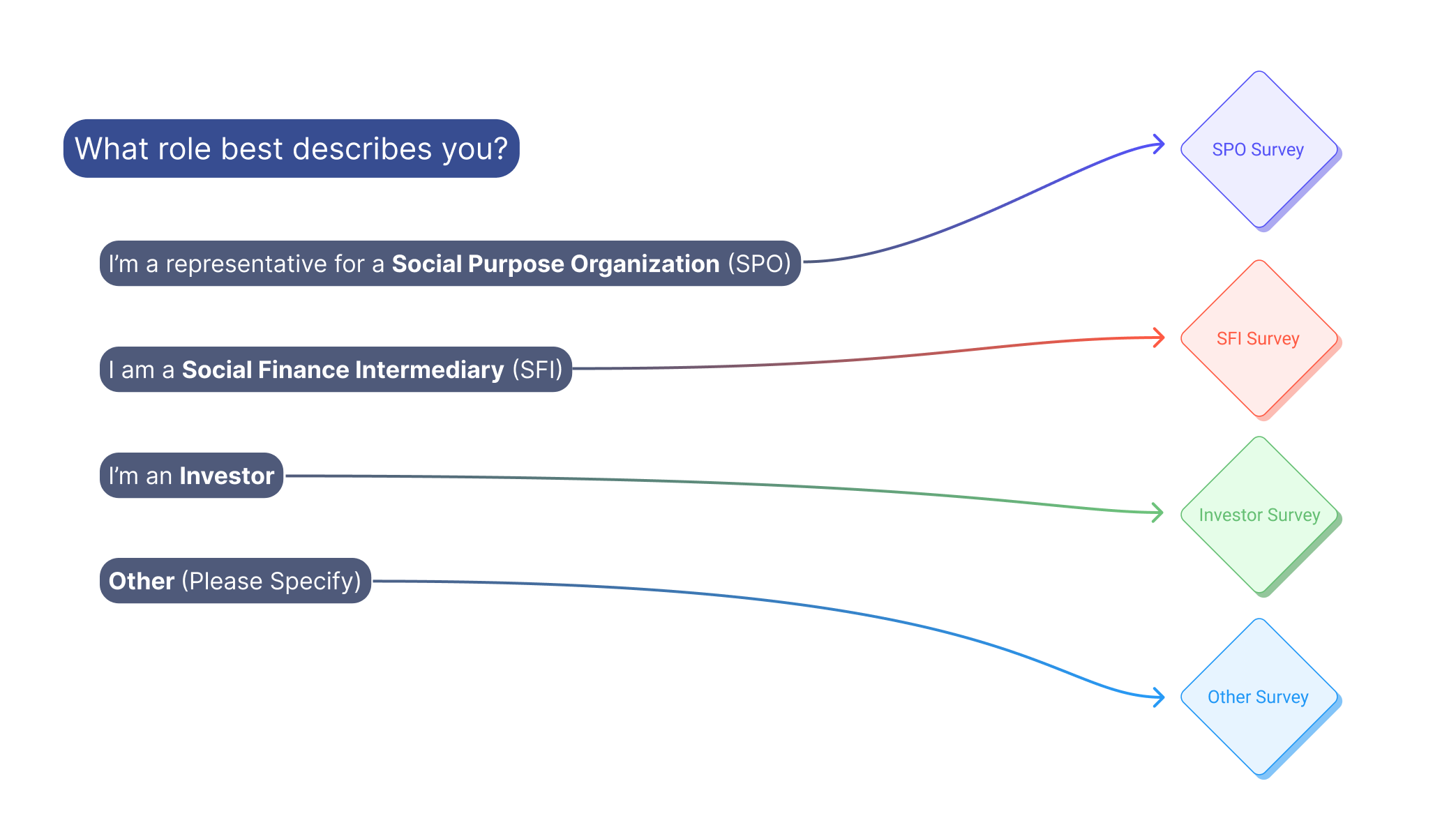 Conditional logic flow from the Social Finance Fund survey, illustrating role-based question branching for SPOs, SFIs, investors, and other user types.
Next, I facilitated multiple stakeholder workshops to:
We used AI tools to generate early conceptual sitemaps and page flows—less for final outputs, and more as visual conversation starters. These drafts helped spark critical debate and surfaced both tension and consensus.
Deliverables
Stakeholder Navigation
One of the most pivotal moments came during a stakeholder alignment meeting that began with tension in the room. There were conflicting perspectives, and one executive in particular voiced early skepticism—both toward the lead organization and the proposed design direction. I focused on listening with patience, validating concerns, and encouraging open critique. As the conversation evolved, we gradually shifted from resistance to collaboration. By the end of the session, that same executive acknowledged the value of the discussion and expressed appreciation for the space to challenge and align constructively. It was a turning point that helped set the tone for future working sessions.
Outcome
The wireframes and research package are now being used to inform an open RFP process for phase two of the project. Briteweb is in a strong position to win the bid—thanks to the clarity, vision, and organizational alignment established during our engagement.
Learnings
The biggest takeaway? Sometimes the real UX problem isn’t the interface—it’s misalignment at the human level.
Let’s connect if you’re looking for someone who can help navigate that too.